How to Build Your Own Photo Session Color Palette Using Clothes You Already Own

Why This Matters
The goal is not to create a perfectly curated Pinterest family.
The goal is to create photographs that feel emotionally honest and visually cohesive without losing personality.
The best styling usually happens when families start with pieces they already love and naturally gravitate toward.
When you wear clothing that already feels like you, it changes everything:
movement becomes easier,
kids feel more comfortable,
confidence increases,
and your images feel far more authentic.
Instead of shopping for an entirely new wardrobe, try building your palette from your existing closet first.
The Simple Formula for Building a Cohesive Color Palette
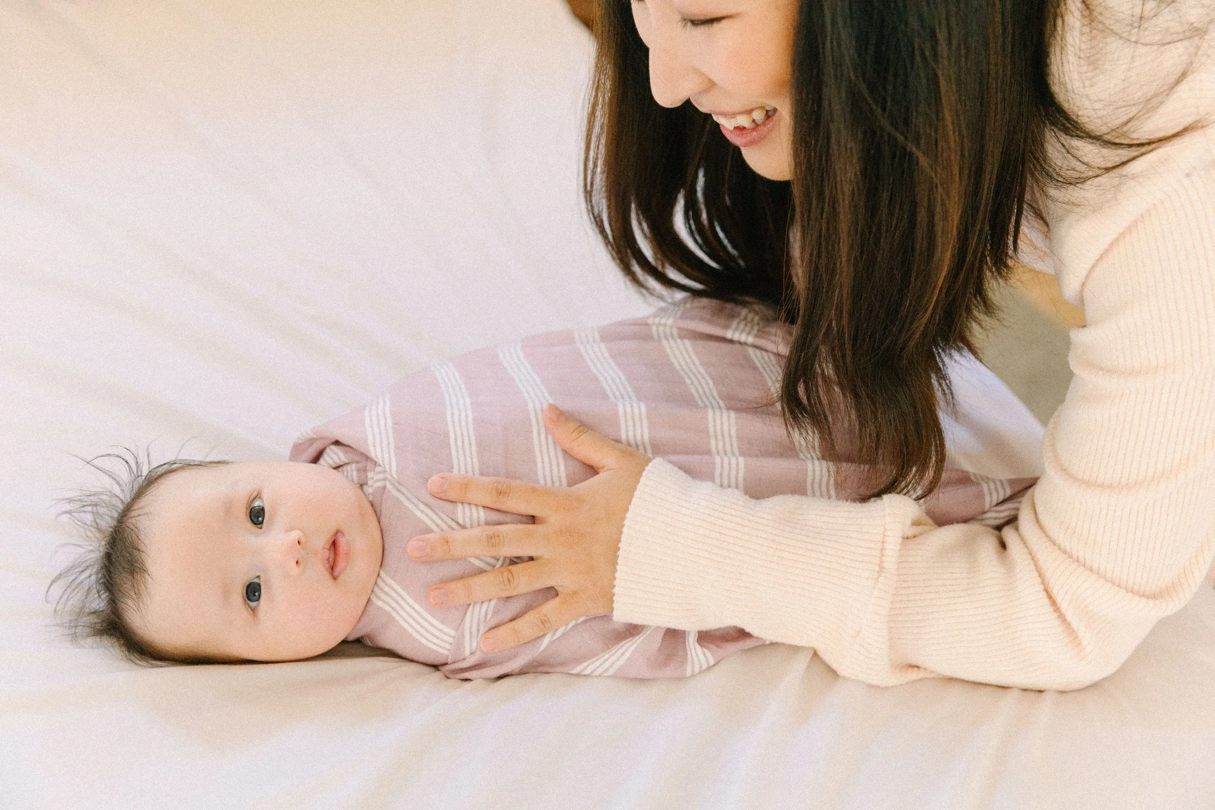
Step 1: Choose a Feeling First
Before choosing colors, ask yourself:
What do I want these photos to feel like?
Your emotional goal should guide your styling choices.
Here are a few examples:
Calm + Intimate: creams, warm neutrals, soft sage
Playful + Energetic: mustard, rust, teal, coral
Cozy + Nostalgic: warm browns, dusty rose, olive
Modern + Editorial: black, gray, ivory, navy
Dreamy + Romantic: lavender, blush, camel
Free-Spirited + Artistic: terracotta, turquoise, textured earth tones
This is where styling becomes storytelling.
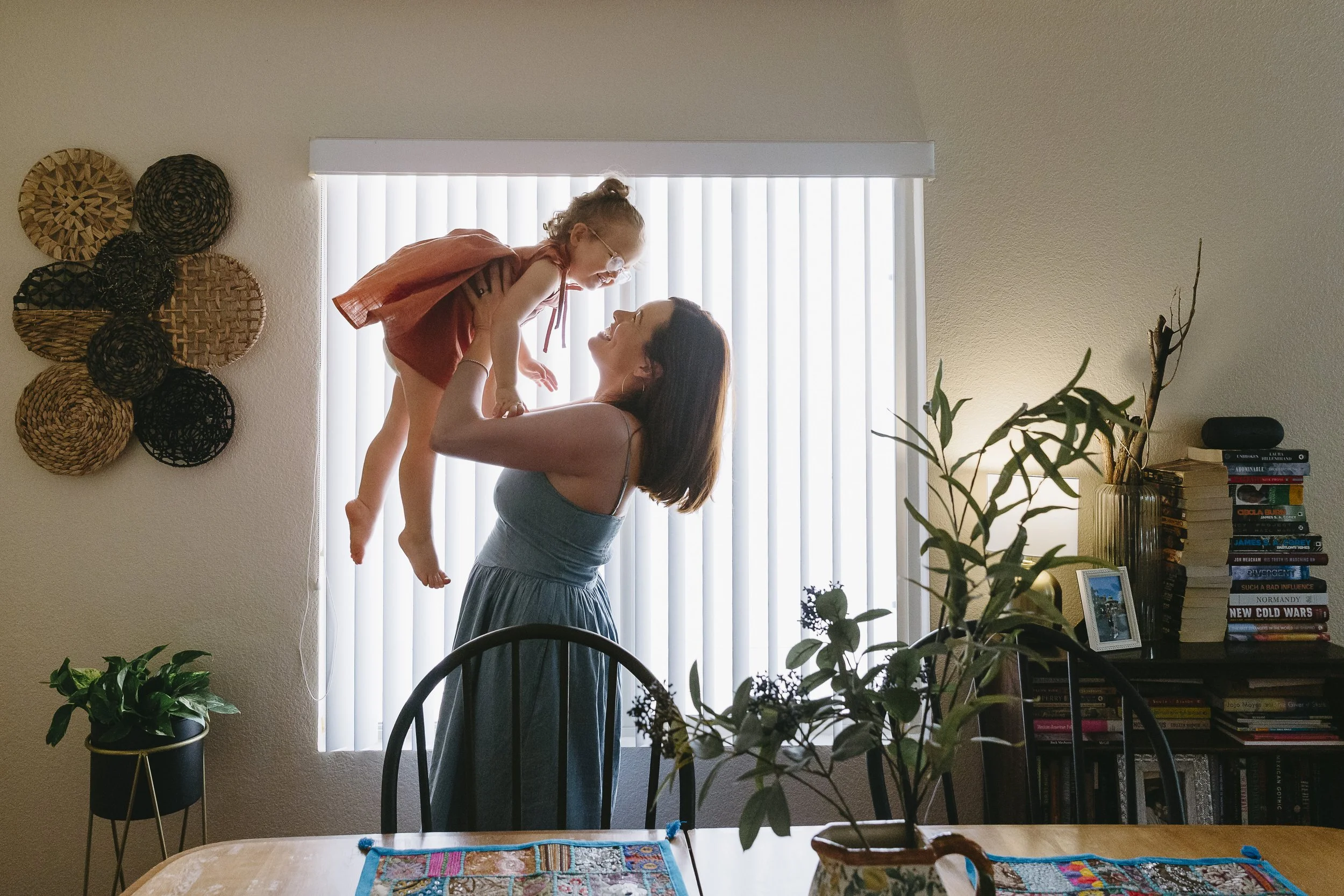
Step 2: Start with One Outfit You Already Love
Don’t start with everyone at once.
Start with:
mom’s dress,
dad’s favorite sweater,
your child’s beloved overalls,
or a piece that already feels emotionally connected to your family.
That piece becomes the anchor.
Then build around it.
Example:
Mom wears a blue denim dress.
Pull cream, terracotta, olive, and warm neutrals from that piece for the rest of the family.
This creates natural cohesion without “matching.”
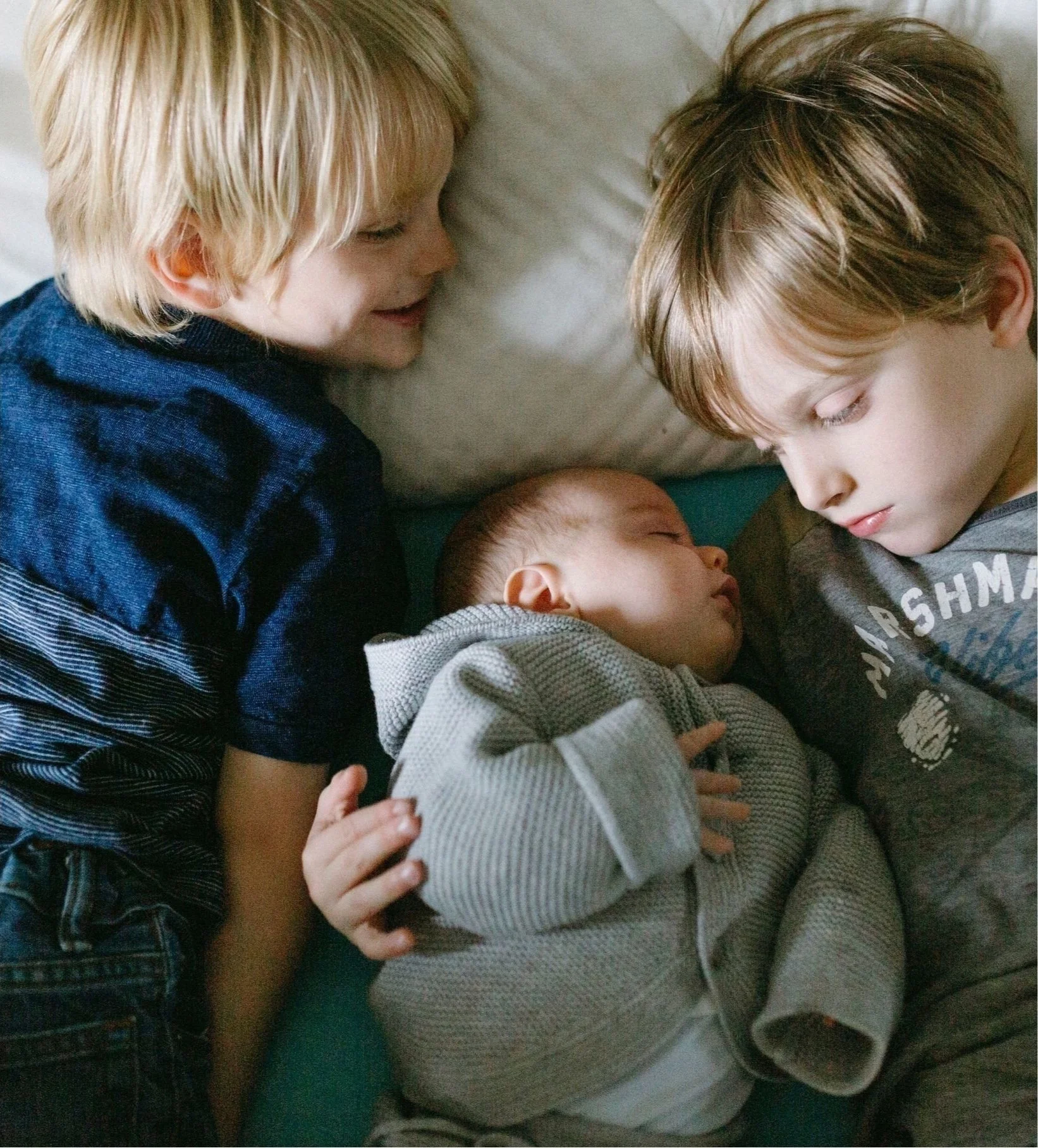

Step 3: Use the 60-30-10 Rule
This is one of the easiest ways to create balance visually.
The Formula
60% = dominant color
Usually the neutral or grounding tone.
Examples:
cream
olive
denim
beige
gray
30% = secondary color
Adds depth and variation.
Examples:
rust
sage
navy
mustard
10% = accent color
Small pops of personality.
Examples:
coral
lavender
turquoise
blush pink
This keeps the image visually balanced while still feeling layered and interesting.
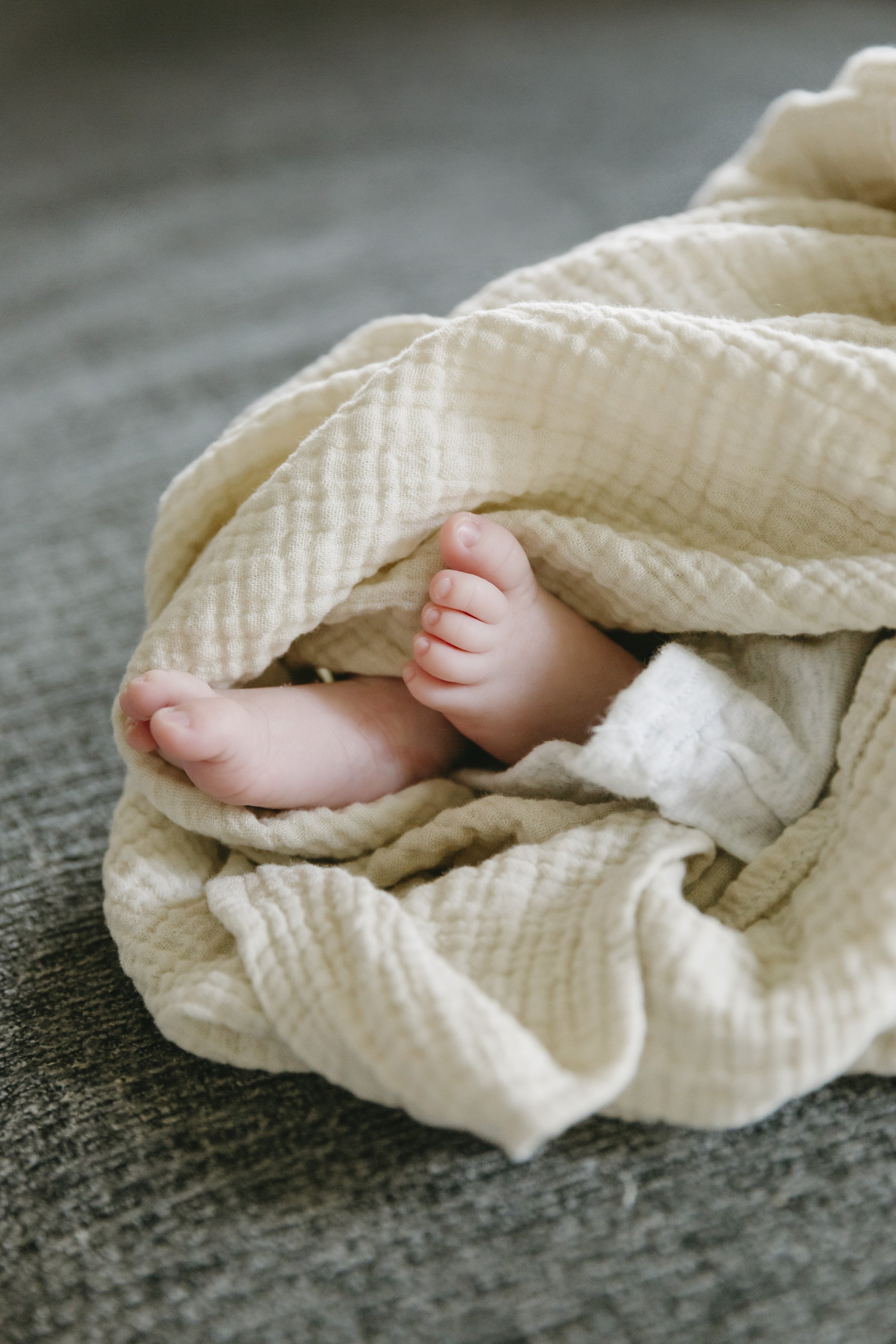
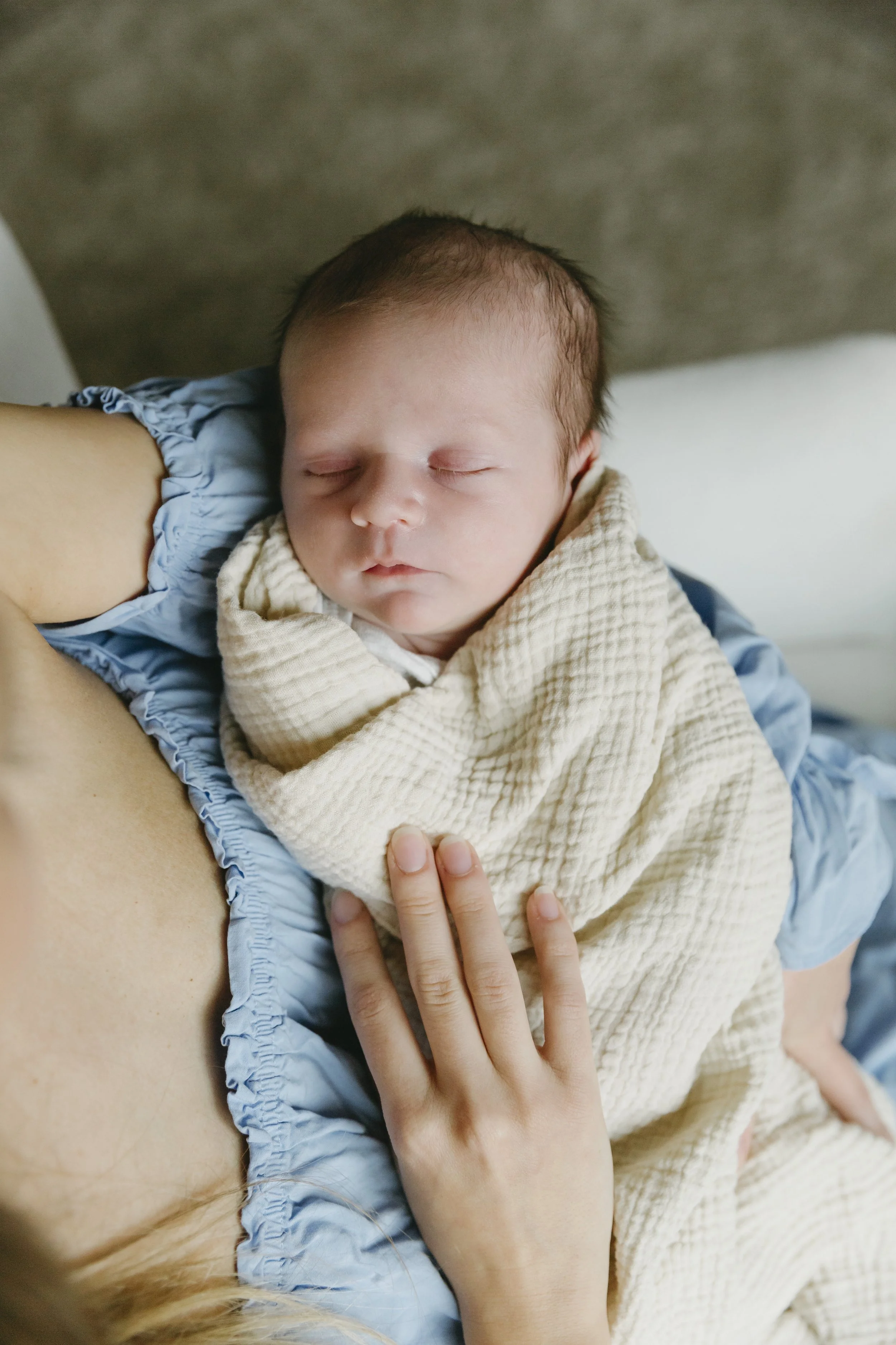
Step 4: Mix Texture More Than Pattern
One of the biggest styling mistakes people make is relying only on color.
Texture matters just as much.
Especially in photography.
A neutral palette can still feel incredibly rich when you combine:
linen
cotton gauze
waffle knit
denim
suede
crochet
ribbed knits
embroidery
corduroy
soft wool
Texture creates visual depth without overwhelming the image.
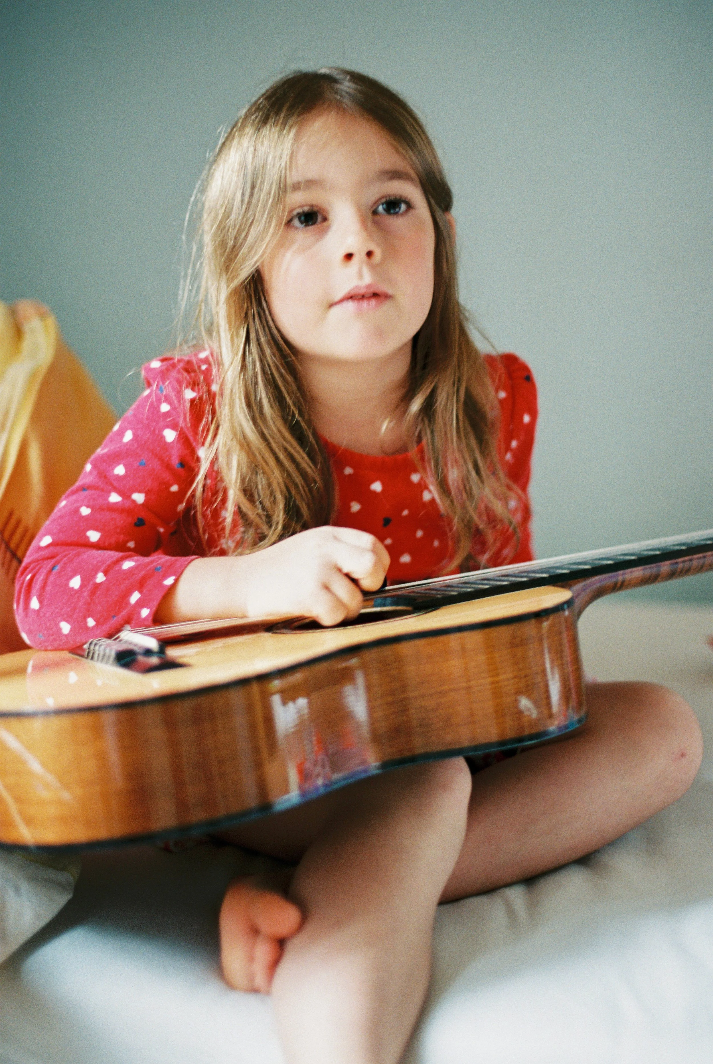
Step 5: Use Patterns Carefully
Patterns are beautiful when balanced intentionally.
A good rule:
one large-scale pattern,
one subtle texture or micro-pattern,
and the rest solids or soft textures.
Good Pattern Examples
tiny florals
muted stripes
gingham
soft plaid
embroidered details
textured knits
Patterns to Avoid
neon prints
large logos
athletic graphics
ultra-busy geometric prints
characters/cartoons
harsh black-and-white micro patterns
You can see examples of how textures, layers, and patterns work together in these real-life palette examples for family and lifestyle sessions.
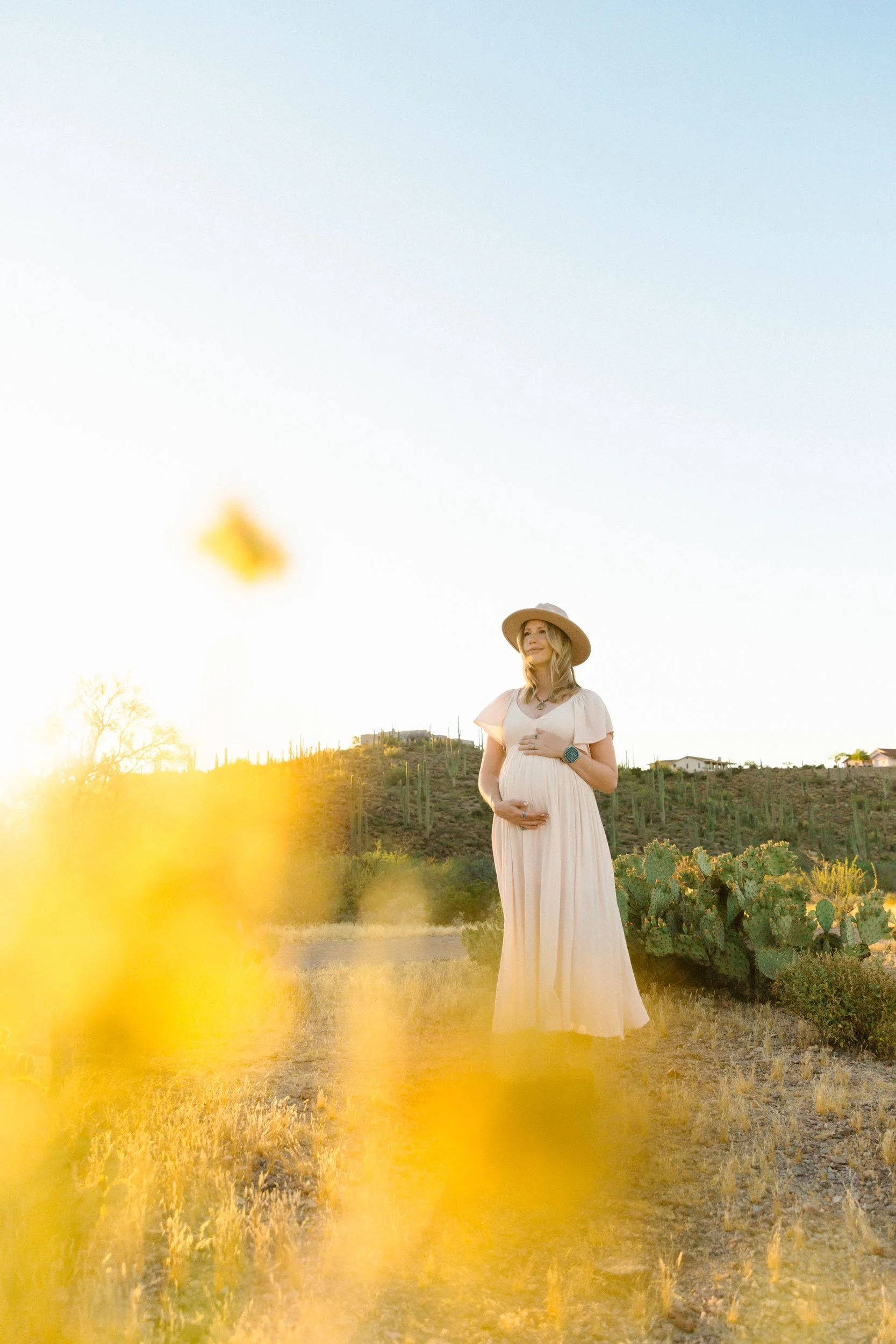
Step 6: Think About Your Environment
Your location should influence your styling.
Desert Sessions
Best with:
warm neutrals
sage
terracotta
rust
cream
muted earthy tones
Urban Sessions
Best with:
black
white
denim
navy
charcoal
structured silhouettes
In-Home Sessions
Best with:
soft textures
cozy layers
creams
muted tones
lived-in fabrics
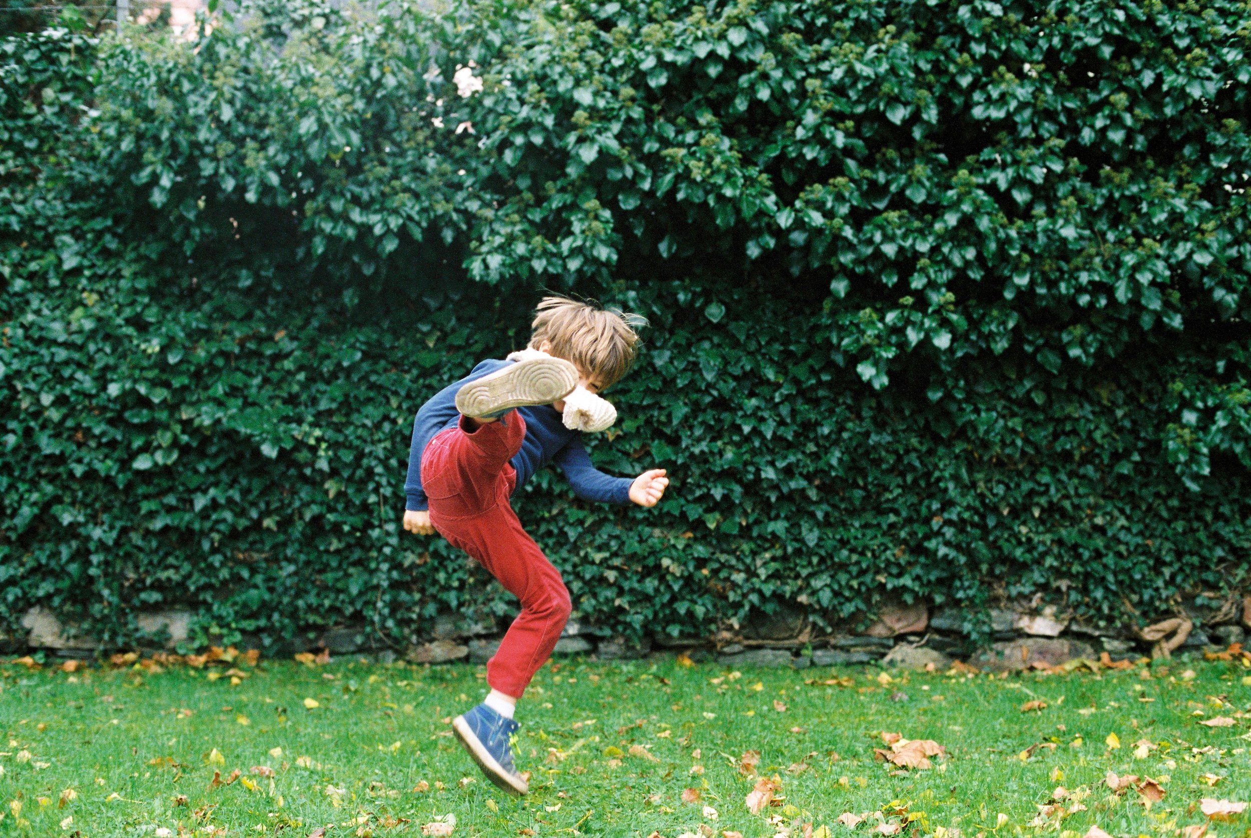
Green Outdoor Locations
Best with:
warm neutrals
dusty blues
mustard
camel
muted pinks
Avoid dressing in colors that completely blend into the environment.
You want harmony — not camouflage.
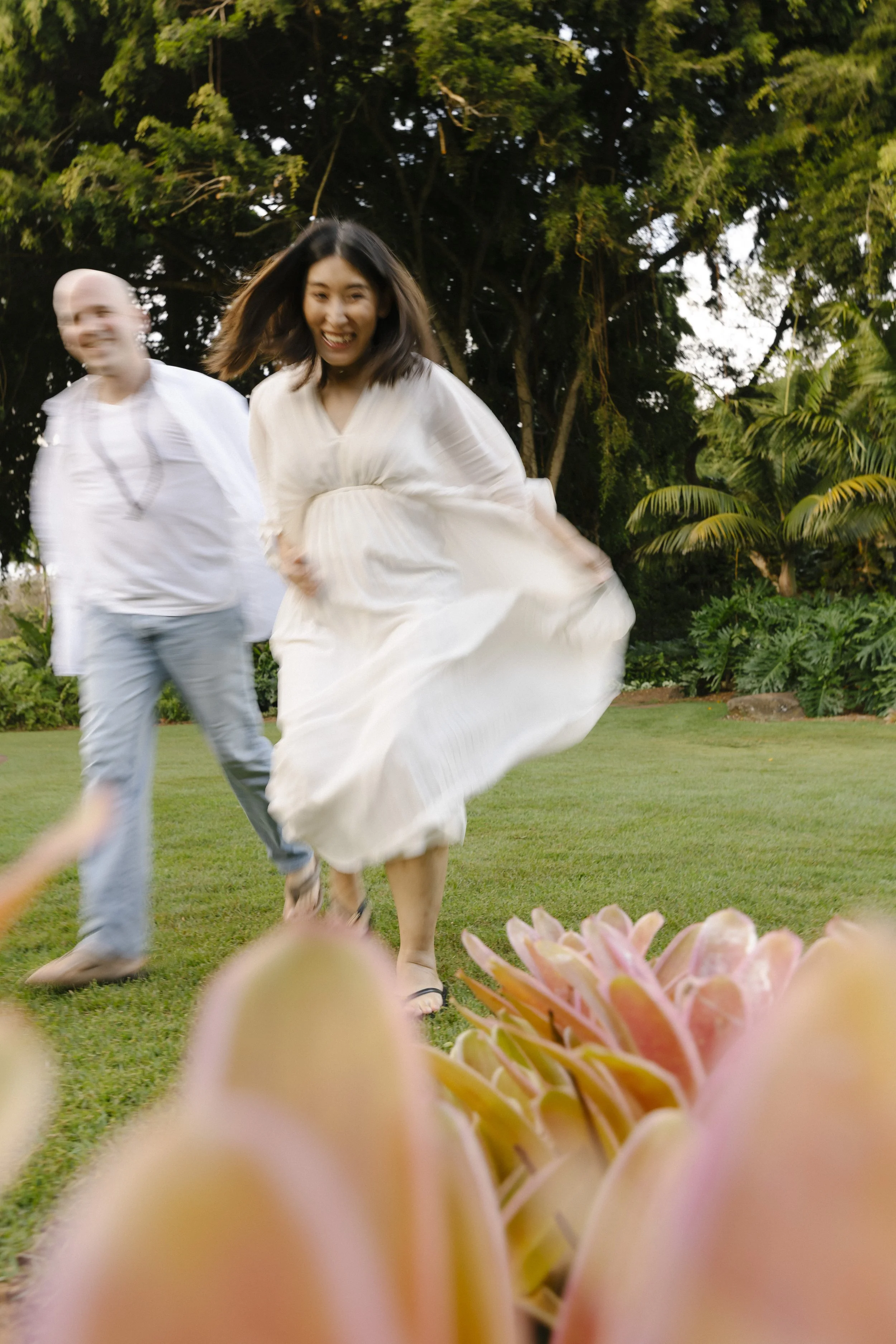
Step 7: Prioritize Movement and Comfort
If something constantly needs adjusting, pulling, tugging, or fixing, it probably won’t photograph well.
Great photo-session clothing:
moves naturally,
breathes well,
allows sitting comfortably,
and feels good to wear.
This is especially important for:
toddlers,
newborn sessions,
maternity sessions,
and playful family sessions.
Step 8: Lay Everything Out Together
Before your session:
place all outfits on a bed or floor together,
remove anything pulling too much attention,
check for texture balance,
and make sure tones feel connected.
This simple step helps you see:
if one item feels too bright,
if a pattern is overpowering,
or if another texture is needed.
It also helps prevent last-minute stress.

My Favorite “Secret” Styling Trick
Choose one unexpected connecting detail.
Examples:
everyone has warm brown shoes,
subtle cream textures throughout,
touches of denim,
repeated gold jewelry tones,
or woven textures across multiple outfits.
Tiny repeated details create cohesion subconsciously without feeling forced.
Don’t Forget the Little Details
Some of the most personality-filled images come from the tiny details families almost forget to bring.
Accessories, textures, and meaningful objects can add movement, color variation, and storytelling to your session in a really natural way.
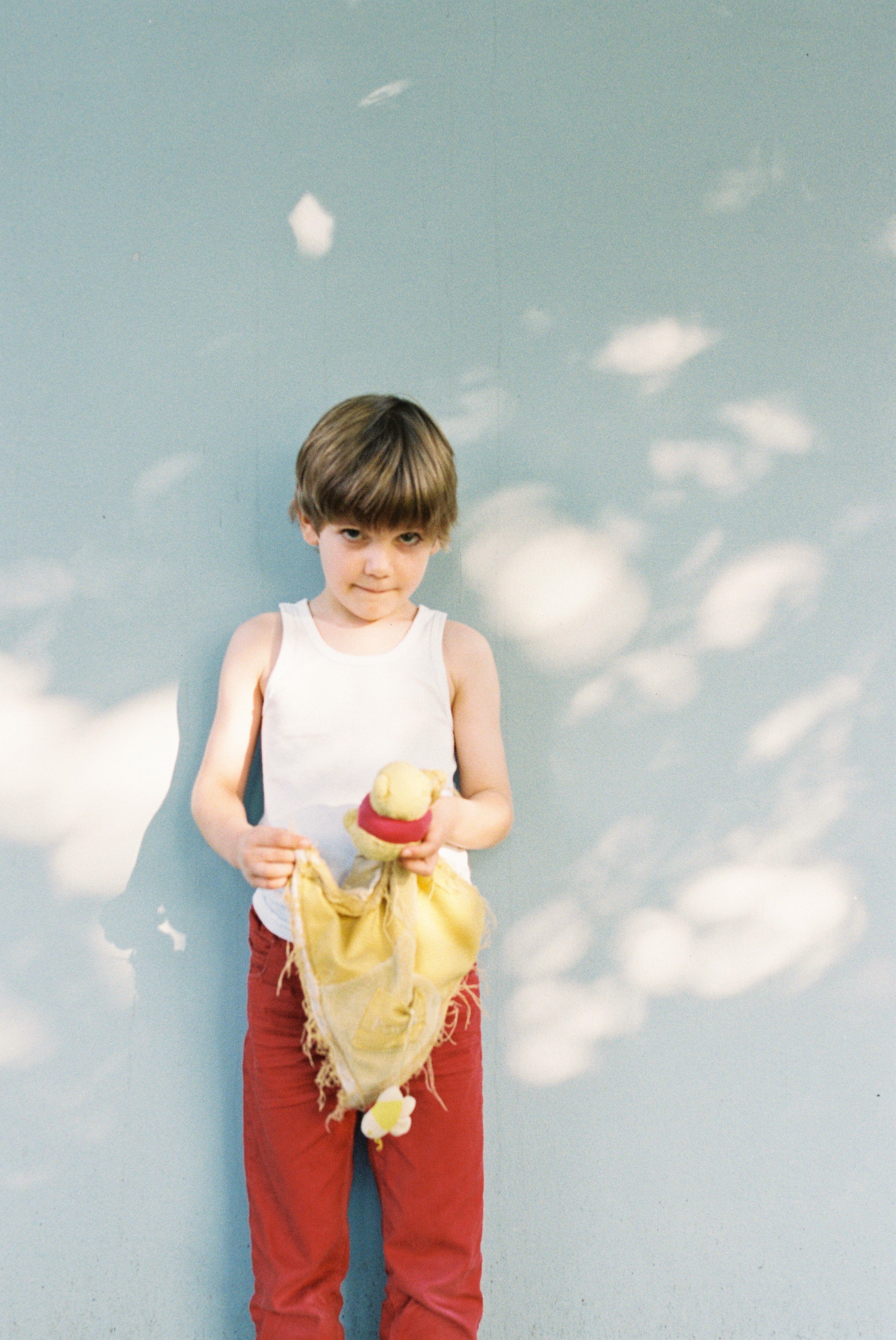
A few favorites:
woven hats
layered jewelry
suspenders
textured hair bows or scarves
vintage sunglasses
cozy knit blankets
well-loved stuffed animals
patterned quilts
baskets
flowers
a colorful ball
favorite books
popsicles, oranges, cookies, or picnic snacks
skateboards, bikes, or roller skates
instruments or hobbies your family genuinely loves
One of my favorite styling tricks is using these items to quietly repeat your accent color throughout the session.
For example:
a mustard blanket in a neutral palette,
a rust-colored ball in a bohemian-inspired session,
a sage green bow or cardigan layered into an earthy desert palette,
or coral-colored fruit and drinks for a playful summer session.
These tiny repeated details create visual cohesion without making the styling feel forced or overly “matchy.”
And honestly? Sometimes the item doesn’t even need to look perfect.
A toddler’s favorite worn blanket, a pair of scuffed cowboy boots, or your child’s beloved stuffed bunny often ends up becoming one of the most emotionally meaningful parts of the gallery years later.
The best sessions are the ones that feel like your real life — just beautifully documented.
Styling Should Feel Like You
You do not need:
perfectly matching outfits,
expensive new clothing,
or a Pinterest-perfect wardrobe.
You need:
connection,
comfort,
personality,
movement,
and colors that support the feeling you want your images to hold.
The most meaningful photographs usually happen when families stop trying to look perfect and start focusing on feeling present together.
Need Inspiration First?
If creating your own palette feels overwhelming, start here:
→ Read: 8 Beautiful Color Palettes for Family Photos
Inside, you’ll find:
outfit combinations for families of four,
location ideas,
texture and pattern inspiration,
styling tips,
and session-specific recommendations.
Need help pulling outfits together?
When you book a session with Jenna Reich Photography, I’m always happy to help guide you through styling, color coordination, and choosing outfits that feel authentic to your family and photograph beautifully in your chosen location.
